
For decades, Melbourne’s southeast was the part of the city people apologised for living in. Too far from the CBD. No good train. Not quite bayside, not quite the Ranges. The affordable SE corridor option you chose when you couldn’t afford anything else.
Then 2025 happened. Frankston ranked number one for growth across all of Melbourne. Casey outpaced Greater Melbourne for the calendar year. The Metro Tunnel opened — and suddenly the commute that defined the southeast’s discount got materially better. So is this a genuine shift? Or just a hot market doing what hot markets do before they cool down?
1. The Big Picture — What’s Actually Happening Out Here
Two structural forces are driving this corridor right now. Some well below. First-home buyers and young families who can’t get into the inner suburbs are finding genuine value out here. The Metro Tunnel opened in February 2026 — and that’s the biggest real upgrade to southeast Melbourne’s commute in decades. Over 100 new weekly services on the Cranbourne and Pakenham lines, now running directly through the CBD to Town Hall, State Library, Parkville, and Anzac stations.
The Casey LGA grew 6.2% in 2025 — beating Greater Melbourne’s 4.8%. Frankston led all Melbourne SA3 regions in January 2026 at 14.3% annual growth. And the vacancy rates across the SE corridor are tight enough to make rental investors pay close attention.
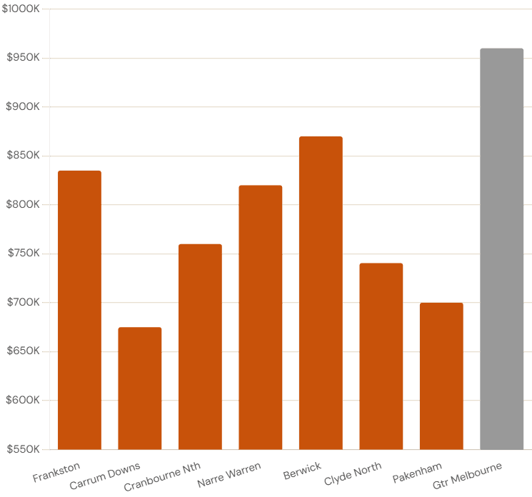
2. Master Data Table — All Seven Suburbs at a Glance
This is your cheat sheet for the SE corridor in April 2026.
SE Corridor Master Data | April 2026 Sources: YIP/CoreLogic Apr 2026 · Cotality via Berwick Star News Jan 2026 · HTAG Analytics Mar 2026 · PRD Berwick 2025
All figures approximate. General information only — not financial or investment advice.
A few things worth noting before we go suburb by suburb. Frankston’s growth stands apart. But look at Carrum Downs — the most affordable suburb in the table, with the fastest selling time in the entire corridor at 13 days. And Pakenham at $700,000 selling in 15 days with over 1,000 transactions in 12 months. That’s demand depth, not noise.
3. Frankston — Melbourne’s Number One Growth Suburb
Frankston ranked number one across all Melbourne SA3 regions in January 2026 with annual growth of 14.3%, according to Cotality data compiled by OpenAgent. And it didn’t just peak there — Cotality notes it “held a top-ranking position in Melbourne’s highest growth list across the past six months.”
Why is this happening?
The affordability argument is real. Buyers priced out of Brighton, Mentone, and Mordialloc are finding a version of bayside living here at a genuine discount. The school zone premium adds another layer. HTAG Analytics flags that pockets within the Frankston High School Zone consistently command higher prices — a well-documented Melbourne pattern that means aggregated medians understate what’s happening in the best streets.
And supply is the final piece. InvestorKit’s March 2026 data shows listings dropped 7.62% over the prior 12 months. Fewer homes coming to market, buyer demand staying strong — that combination drives prices up.
Frankston 3199 Key Indicators | April 2026 Sources: YIP/CoreLogic · OnTheHouse/Cotality · HTAG Analytics
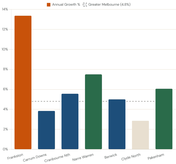
The Honest Caveat: With 5-year growth already at 37.66%, buyers entering Frankston now are doing so after a very strong run. Markets don’t sustain 13-14% annually indefinitely. The fundamentals are real — but so is the fact that much of the re-rating has already happened.
Carrum Downs — The Quiet Achiever Nobody’s Talking About
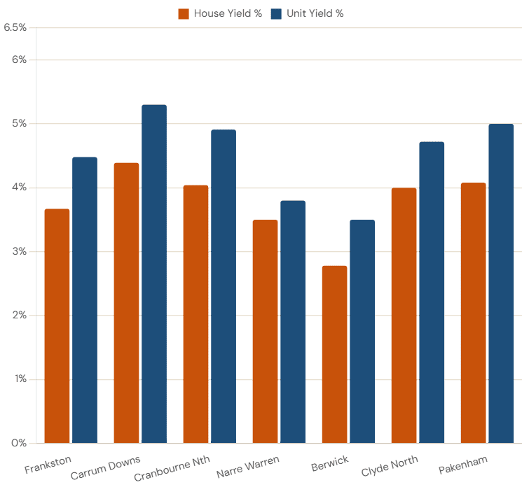
Thirteen days on the market for houses. A vacancy rate of 0.7% — the tightest in the entire corridor, well below the 2% level considered “balanced.” An estimated median of $675,000 — the most affordable suburb in this report. And a unit yield of approximately 5.3% gross — the highest unit yield in the entire corridor.
Key Finding: Carrum Downs has the tightest vacancy rate in the corridor at 0.7% — well below the 2% balanced threshold. Combined with 13-day average selling time and a 5.3% gross unit yield, this is the suburb that presents the strongest demand-versus-supply signal in the entire SE corridor. And almost nobody is writing about it.
Cranbourne North & the Casey LGA — The Growth Engine
Cranbourne North ($760,000 median, +5.56% annual, 20 days on market) sits at the heart of that story. It’s established enough to have all the family infrastructure you need — schools, parks, community facilities — but still priced below the metro median. And from February 2026, it has Metro Tunnel connectivity.
Casey LGA Suburb Growth Snapshot | 2025 Calendar Year Source: Cotality via Berwick Star News, January 2026
| Suburb / Area | Annual Growth | Key Note |
| Casey LGA overall | 6.2% | Median $821,925. Strongest since 2021. |
| Cranbourne North | 7.7% (Cotality) | Strong family demand, established suburb |
| Cranbourne West | 7.4% | Outperforming metro average |
| Narre Warren | 7.5% | Best performer in established Casey belt |
| Lyndhurst / Hallam | 7.4% | Strong mid-belt gains |
| Clyde North | 5.3% (Cotality) / 2.85% (CoreLogic) | Volume market, new supply competition |
| Clyde | 5.5% | Greenfield boundary suburb |
Note: Cotality measures full-year 2025 calendar growth; CoreLogic trailing 12-month measures may differ slightly. General information only.
The Cranbourne Rail Extension — What You Actually Need to Know
Here’s the honest status: It is a proposed project under long-term planning study — not a confirmed infrastructure delivery. Do not make property decisions based on this as a certainty. Source: Wikipedia — Proposed Melbourne rail extensions.
Narre Warren & Berwick — Casey’s Established Premium Belt
If you want lifestyle over yield, this is your tier of the SE corridor. Both suburbs attract professional families, sit inside premium school catchments, and consistently trade at the top of the Casey price range.
Berwick vs Narre Warren Comparison | April 2026 Sources: PRD Berwick 2025 · Cotality via Berwick Star News · HTAG Analytics
| Indicator | Berwick 3806 | Narre Warren 3805 |
| Median house | $870,000 | $820,000 (est.) |
| Annual growth | 5.0% | 7.5% |
| 5-year growth | ~32% | ~28% |
| Weekly rent (houses) | $551/wk | $550/wk |
| Gross house yield | 2.78% | ~3.5% (est.) |
| Days on market | ~35 days | ~28 days |
| Key characteristic | Lifestyle premium — school zones | Strong capital growth — Fountain Gate |
Clyde North & Pakenham — The Volume Markets
- Pakenham ($700,000 median) had 1,039 house sales over the past 12 months — the highest transaction volume in this report — and they sold in an average of just 15 days. At 62km from the CBD, that level of turnover speed is genuinely striking. 6.06% annual growth and a 35% five-year gain show this market has real, sustained momentum.
- Clyde North ($740,500 median) had even more house sales — 1,062 — but they took an average of 43 days to sell. Why the contrast? New-build competition. That choice slows down the resale market, suppresses urgency, and puts a natural ceiling on price growth.
Key Insight: Pakenham’s 15-day selling time at $700,000 is the most striking data point in the outer corridor. Over 1,000 transactions in 12 months, moving that fast, at that price — that’s genuine demand depth. Clyde North’s 43-day DOM isn’t a demand problem; it’s a new-supply competition problem.
Rental Yields & Weekly Rents
Here’s the honest split in this corridor. Buy in Frankston or Berwick and you’re buying the lifestyle premium. People want to live there, prices reflect that, and the yield has been squeezed as a result. Your bet is on the capital growth continuing — not on the rent covering your costs comfortably.
Buy in Carrum Downs, Cranbourne North, Clyde North, or Pakenham and the rental maths looks more interesting. All four sit above 4% gross yield. That’s not life-changing money, but it’s the level where investors generally feel the property is pulling its own weight month to month.
All yields are gross before costs. Net yields are typically 1.0–1.5 percentage points lower. Always model from net yields when making decisions.
One thing worth repeating: the difference between a 4.0% gross yield and a 4.0% net yield is significant. Once you factor in property management fees, council rates, insurance, maintenance, and vacancy, your actual return lands closer to 2.5–3.0%. That’s still reasonable for an outer Melbourne suburb — but it’s not the number on the table above.
| Suburb | House Yield | Unit Yield | House Rent/Wk | Unit Rent/Wk | Vacancy Rate |
| Frankston | 3.67% | 4.48% | $580 | $490 | 1.2% |
| Carrum Downs | 4.39% | 5.3% | $570 | $475 | 0.7% |
| Cranbourne North | 4.04% | 4.91% | $585 | $520 | 1.8% (est.) |
| Narre Warren | 3.50% | 3.80% | $550 | $490 | 1.5% (est.) |
| Berwick | 2.78% | 3.50% | $551 | $500 | 1.3% |
| Clyde North | 4.00% | 4.72% | $600 | $550 | 1.9% |
| Pakenham | 4.08% | 5.00% | $560 | $500 | 1.7% |
Market Speed Signals — Days on Market & Vacancy Rates
Days on market and vacancy rates are two of the most useful leading indicators in property. They tell you what’s happening right now — not what happened six months ago when a sale was first listed.
Market Speed Signals | April 2026 Sources: YIP/CoreLogic · HTAG Analytics · PRD Berwick
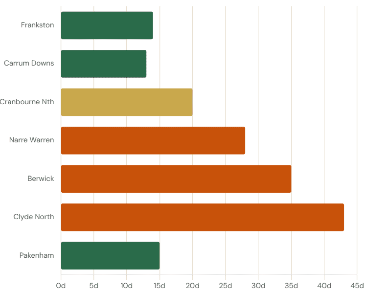
The contrast between Pakenham and Clyde North is the most instructive comparison in the SE corridor. Nearly identical sales volumes (1,039 vs 1,062 houses), similar price points — but Pakenham sells in 15 days and Clyde North takes 43. The only real difference is that Clyde North’s resale market competes directly with new-build packages. That’s the new-supply effect in action.
The Infrastructure Pipeline — What’s Built, What’s Coming?
The SE corridor’s infrastructure story is one of the central arguments for the region’s medium-term property case. Here’s the full picture — with an honest status on each project.
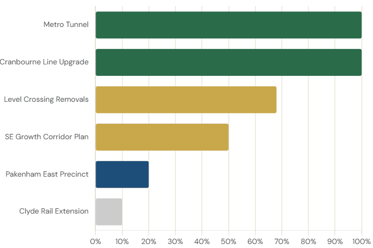
Infrastructure Pipeline Status | April 2026 Sources: Victorian Big Build · Rail News Australia · Wikipedia proposed Melbourne rail extensions · DJCS SE Growth Corridor Plan
The Metro Tunnel is the headline — it’s done, it’s running, commuters are using it right now. The Clyde rail extension is the big “maybe.” Everything else either reinforces the SE corridor’s long-term growth story or is background urban planning work. Read the table accordingly.
How the SE Corridor Compares to Other Melbourne Directions?
Here’s the framing that makes the value argument clearest. Frankston at 42km with 14-day average selling time and 13.37% annual growth is outperforming suburbs significantly closer to the CBD.
The southeast discount has been structural for decades — baked into Melbourne’s cultural geography and buyer psychology. The Metro Tunnel is the first infrastructure delivery in the SE corridor’s history that provides genuine turn-up-and-go CBD connectivity. Our view is that the discount has started compressing. But it will take a full property cycle to fully play out.
The Risks — Because Every Honest Report Has Them
If a property report doesn’t tell you the risks, it’s not a report. It’s a brochure.
- Interest rate sensitivity. The SE corridor’s buyer pool is heavily concentrated in first-home buyers and young families — the demographic most affected by rate movements. The RBA’s February 2026 rise to 3.85% hits this group harder than it hits buyers in higher-income inner suburbs.
- Frankston’s growth sustainability. 13.37% annual growth is exceptional. It also means buyers today are entering after a very strong run — 37.66% over five years. Markets that have re-rated significantly can plateau or pull back as they close the gap to fundamentals.
- Reminder: Nothing in this article is a buy or sell recommendation. Historical growth rates are not a guarantee of future performance. Property values can fall.
Final Thought
Melbourne’s southeast has spent decades being underestimated. Overlooked. The corridor people moved to when they ran out of other options. The data in 2026 tells a different story. A Metro Tunnel that actually works. A Casey LGA outpacing the city. A suburb on the bay selling homes in 14 days. And vacancy rates are so tight that renters and investors alike are paying close attention.
Whether this corridor is right for you depends on your situation, your timeline, and your appetite for risk — factors no data report can answer for you. What a data report can do is make sure you’re working from the right information when you have that conversation with your adviser.
That’s why NextHouse exists. Independent analysis. Named sources. No agenda other than clarity. Follow NextHouse for the next Melbourne corridor report — free, independent, always data-first.
This is not a corridor to rush into because of FOMO. It’s a SE corridor to approach with patience, data, and a clear 7-10 year view.
FAQs
- Is Frankston a good investment in 2026?
Frankston recorded 13.37% annual house price growth to April 2026 and ranked number one across all Melbourne SA3 regions in January 2026 at 14.3% (Cotality via OpenAgent). With 671 house sales and 14-day average selling time, it’s an extremely liquid, high-demand market. The risk is that 5-year growth is already at 37.66% — buyers are entering after a significant re-rating, not at the start of one. - What did the Metro Tunnel actually change for SE Melbourne?
The Metro Tunnel opened in February 2026, delivering over 100 new weekly services on the Cranbourne and Pakenham lines, with direct connections through the CBD to Town Hall, State Library, Parkville, and Anzac stations — bypassing the old City Loop congestion. For commuters from Berwick, Cranbourne, and Pakenham, this is a material improvement in daily travel time and reliability. - What’s the cheapest entry point in the SE corridor?
Pakenham at $700,000 is the most affordable suburb in this report. Carrum Downs at an estimated $675,000 is in a similar range but significantly closer to the CBD at 36km versus 62km. Both offer house yields above 4%. The trade-off for Pakenham is distance; for Carrum Downs, house sales volume is lower, meaning the market is less liquid. All medians are approximate — check current data before making any decisions. - Is the Cranbourne to Clyde rail extension confirmed?
No. As at April 2026, the Cranbourne to Clyde rail extension is a proposed project in long-term planning. It is not funded, not approved, and has no confirmed construction commencement date. The SE Growth Corridor Plan designates Clyde North and Clyde as Major Town Centres with rail in the long-term vision — but a planning designation is not a construction commitment. Do not make property decisions based on this as a certainty. - Which suburb has the best rental yield in the SE corridor?
For unit yield, Carrum Downs leads at approximately 5.3% gross. For house yield, Pakenham (4.08%) and Clyde North (4.00%) lead, with Cranbourne North close behind at 4.04%. Berwick has the lowest house yield at 2.78%, reflecting its premium price. All yields are gross before costs — net yields are typically 1.0–1.5 percentage points lower. Always model from net yields.
Disclaimer: This article is published by NextHouse.com.au for general information and educational purposes only. It does not constitute financial, investment, property, legal, or taxation advice. The author is not a licensed financial adviser, real estate agent, or buyer’s advocate. Property values can fall as well as rise. Past growth is not a reliable indicator of future performance. Infrastructure project timelines are subject to change. Always obtain independent advice from a licensed financial adviser, qualified buyer’s advocate, and registered conveyancer before making any property decision.